App Store Screenshot Optimization: What Top 100 Apps Do Differently
We analyzed screenshots from 100 top-grossing apps. Here are the design patterns, text overlays, and layouts that convert browsers into downloaders.
Screenshots are your app's storefront. They're the first visual element users see in search results, and they determine whether someone taps "Get" or scrolls past. We analyzed the top 100 grossing apps to find what works.
Finding #1: Text Overlays Are Universal
94 of the top 100 apps use text overlays on screenshots. The pattern is consistent: a bold headline (4-6 words) above or below the device frame. Pure device screenshots without text are nearly extinct among top apps.
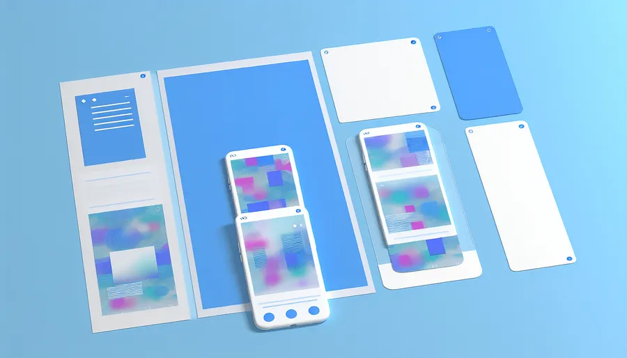
Finding #2: The First 3 Screenshots Tell a Story
Users see 3 screenshots in search results before scrolling. Top apps use these to convey: (1) What the app does (2) The key differentiator (3) Social proof or result. Think of it as a 3-panel pitch.
Key Stat: Apps that updated screenshots in the last 90 days had 25% higher conversion rates than those with year-old screenshots.
Finding #3: Dark Backgrounds Dominate
67% of top apps use dark or gradient backgrounds. This creates contrast with the white App Store interface and makes device frames pop. Light backgrounds can look washed out.
Finding #4: Video Previews Double Engagement
Apps with video previews see 20-35% more page views. Keep videos under 20 seconds, show the core experience in the first 5 seconds, and always include captions - most users watch on mute.
Your Screenshot Checklist
Use our free ASO audit tool to check your screenshot count and see how you compare.